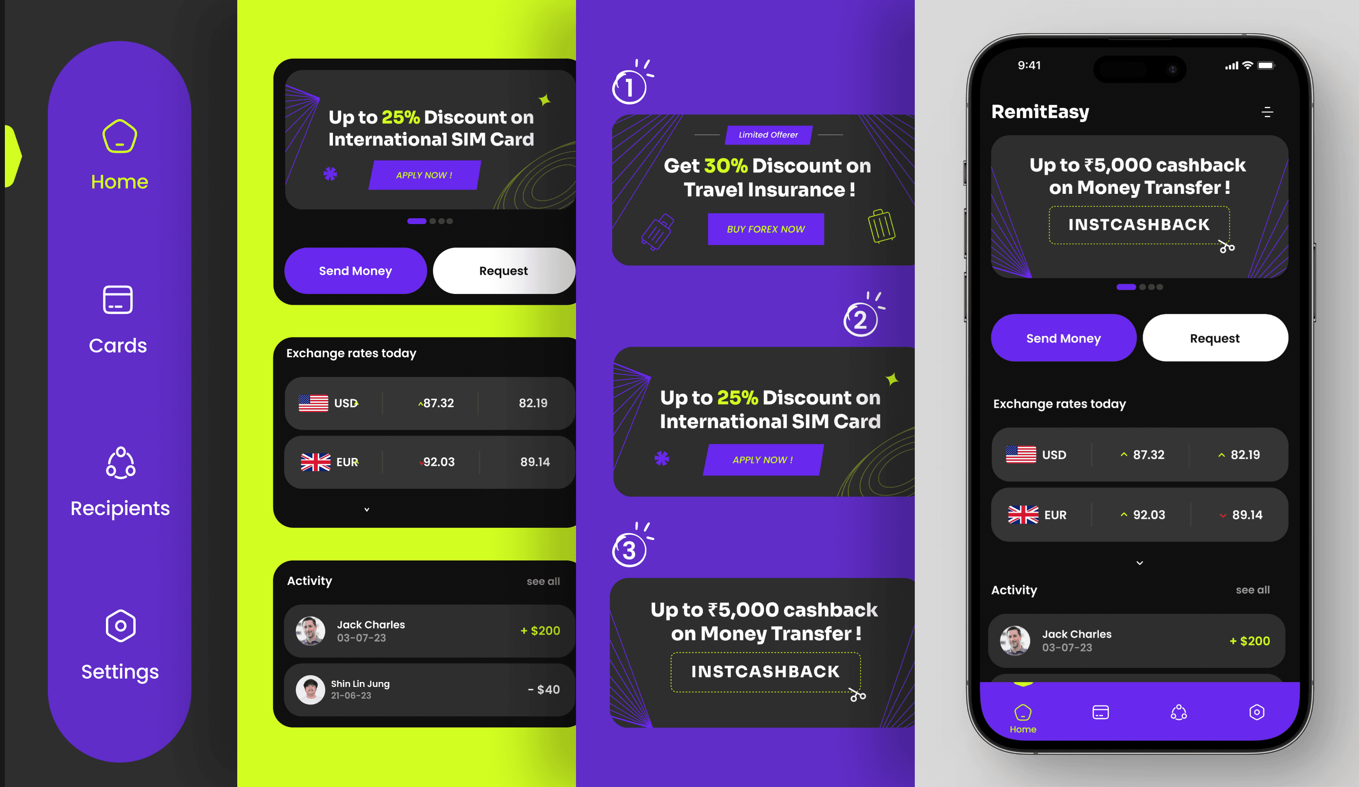
#Remit EasyInternational money transfer made easy.
It is a start up company that is launching a new remittance app that aims to simplify the process of sending money internationally.

OVERVIEW
The aim was to create a remittance app that would provide a secure & cost-effective way for users to send money internationally.
- User Interface
- User Research
- Prototype
Problem
Complex interfaces and slow processing times can be frustrating. That's why we're dedicated to creating a modern and user-friendly remittance application that prioritizes security and transparency.
Approach
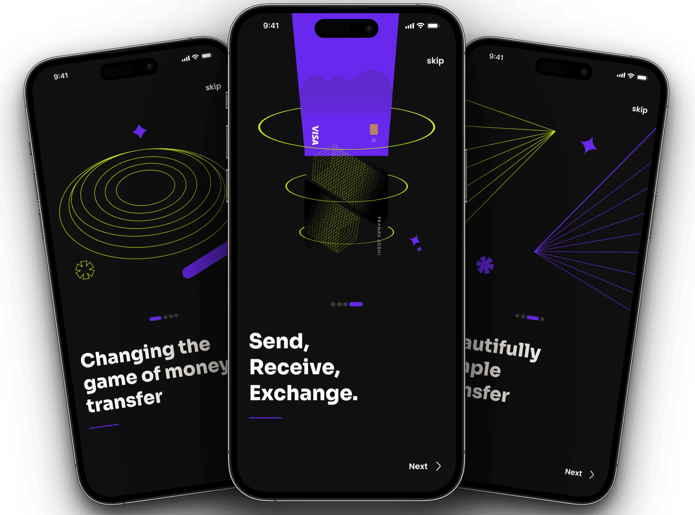
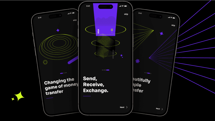
The design of the app should be clean, modern, and user-friendly, with a focus on simplicity and ease of use. The app should have a consistent visual style and colour palette, with clear and legible typography throughout.
Challange
- Addressing security vulnerabilities while maintaining a user-friendly experience.
- Balancing robust encryption and multi-factor authentication with intuitive design.
Solution
- Addressing security vulnerabilities while maintaining a user-friendly experience.
- Balancing robust encryption and multi-factor authentication with intuitive design.
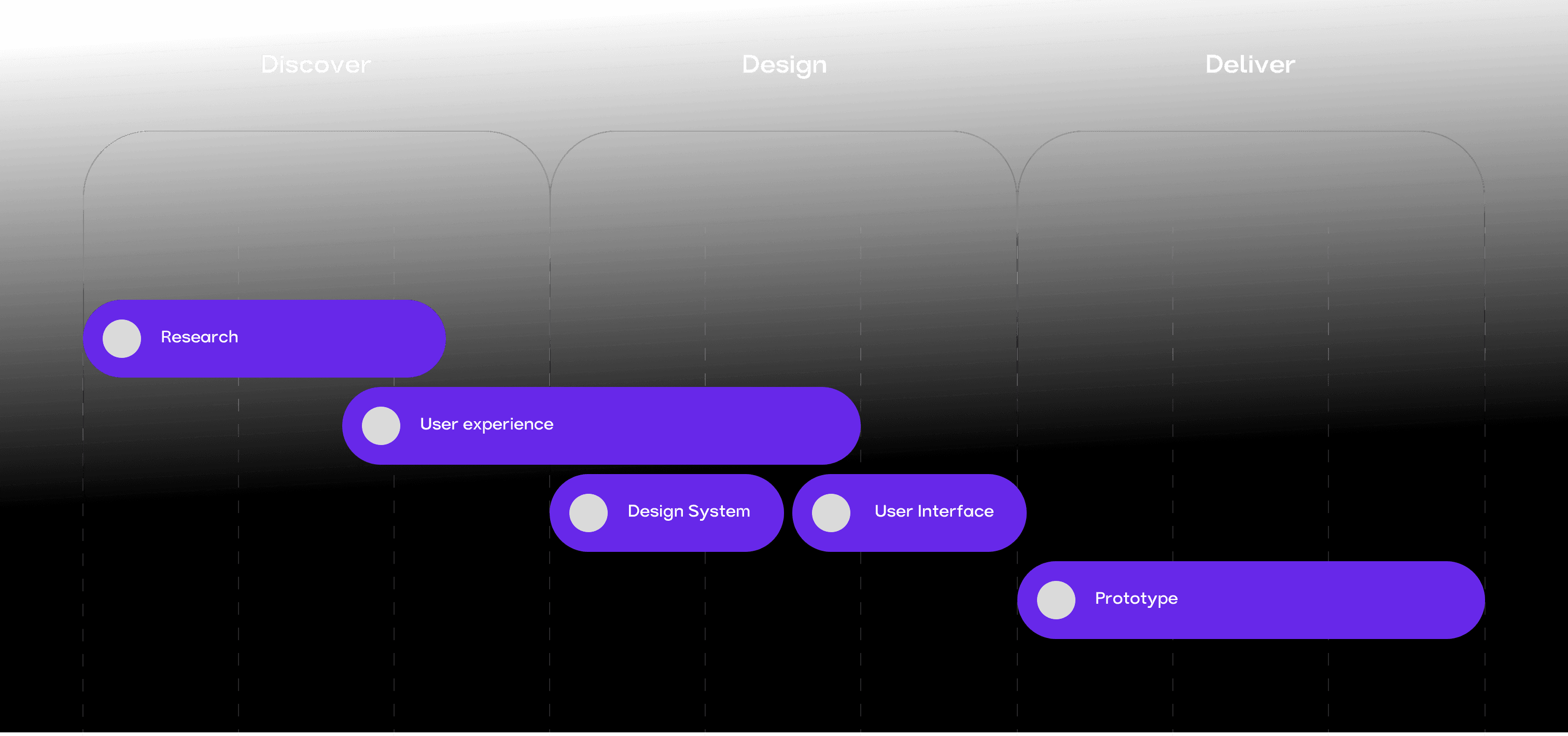
Project Roadmap
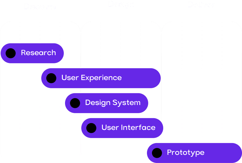
It entails initial market research and user needs analysis, followed by UI/UX design and front-end development. Simultaneously, back-end infrastructure will be established, incorporating secure transaction processing, encryption protocols, and compliance features. The subsequent stages involve iterative testing, refining user experience, and integrating multi-factor authentication.
DURATION AND DELIVERABLES
The project's core objective is crafting a user-friendly API marketplace for Protean. This website will be a central hub for developers to exhibit their APIs, enabling business owners to effortlessly explore, assess, and integrate APIs for amplified service capabilities. The timeline is tentative and could adapt according to project demands. Consistent updates and communication will be upheld to ensure a prompt and prosperous project delivery.
15
Flows
20
Screens
64
Days


Tools
Criteria | ||||
|---|---|---|---|---|
| UI Design | 9/10 | 8/10 | 7/10 | 9/10 |
| UX | 8/10 | 9/10 | 8/10 | 7/10 |
| Features Offered | 7/10 | 9/10 | 8/10 | 6/10 |
| Transaction Fees | 3/10 | 5/10 | 4/10 | 2/10 |
| Exchange Rates | 8/10 | 7/10 | 6/10 | 9/10 |
| Speed of Transactions | 9/10 | 7/10 | 8/10 | 8/10 |
| Security Measures | 9/10 | 8/10 | 7/10 | 9/10 |
| Customer Support | 7/10 | 8/10 | 9/10 | 6/10 |
| App Ratings | 4.75/5 | 4.75/5 | 4.2/5 | 4.6/5 |
| Downloads | 1.2 M | 8.5 M | 5.3 M | 2.7 M |
| Market Presence | Global | Regional | Global | Regional |

User research
We've conducted some fantastic face-to-face interviews with a variety of people, obtaining their opinions and feedback one-on-one. We're excited to use this vital information to provide exactly what clients require!
High fees and undeclared costs when transmitting money.
Anil Sharma
Retired teacher

Currency rates between different money transfer services.
Akshay Sinha
Working professional

Tracking the status of their money transfer is difficult.
Shreya Swami
Student

EMPATHY MAP
Users are often concerned about high costs and fees, varying currency rates etc. These challenges can discourage users from using money transfer providers and may create barriers to entry for new users. Addressing these concerns is important to build trust and loyalty among their users.
Say
- High fees and undeclared costs when transmitting money.
- Currency rates between different money transfer services.
- Long lines at physical locations for money transfers.
- Tracking the status of their money transfer is difficult.
Think
- High fees and undeclared costs when transmitting money.
- Currency rates between different money transfer services.
- Long lines at physical locations for money transfers.
- Tracking the status of their money transfer is difficult.
Does
- High fees and undeclared costs when transmitting money.
- Currency rates between different money transfer services.
- Long lines at physical locations for money transfers.
- Tracking the status of their money transfer is difficult.
Feel
- High fees and undeclared costs when transmitting money.
- Currency rates between different money transfer services.
- Long lines at physical locations for money transfers.
- Tracking the status of their money transfer is difficult.
USER PERSONA
By creating a detailed representation of our target user, we gained invaluable insights into their preferences, pain points, and behaviors. This guided our decision-making process, from UI/UX design to feature prioritization. For instance, the persona's preference for quick, hassle-free transactions led us to prioritize an intuitive interface with clear navigation and minimal steps.


Pranav Joshi
35 yrs. Domestic Worker
Goals
Pranav needs to send money back home to his family in Pune, to cover their daily expenses and education costs for her sister. He wants a fast and reliable way that won't charge high fees or have complex registration processes. He also wants to be able to track his transfers.
Demographics
- Education: High school diploma
- Location: Pune, Maharashtra
- Family: Unmarried
Challenges
Pranav has limited access to banking services in his local area, which can make it difficult to send and receive money. He's also concerned about the security of his personal and financial information when using digital platforms. Finally, he's looking for an app that's available in his local language and provides good customer support in case he needs assistance.
An app that offers low fees, fast transfers, and reliable tracking and notification features would be ideal. Also an app that offers good security measures, two-factor authentication and encryption. Finally, having access to customer support in his local language would help him feel more comfortable and confident.
Motivations
Pranav is motivated by desire to support his family and provide for their needs. He's looking for an app that can help him transfer money quickly and easily, without incurring high fees or being subject to currency fluctuations.
CARD SORTING
We learnt a lot about how users perceive and organize different sorts of transactions and features by doing a card sorting exercise for the app. This assisted us in developing a more user-friendly and intuitive application that matched the needs of our intended audience.

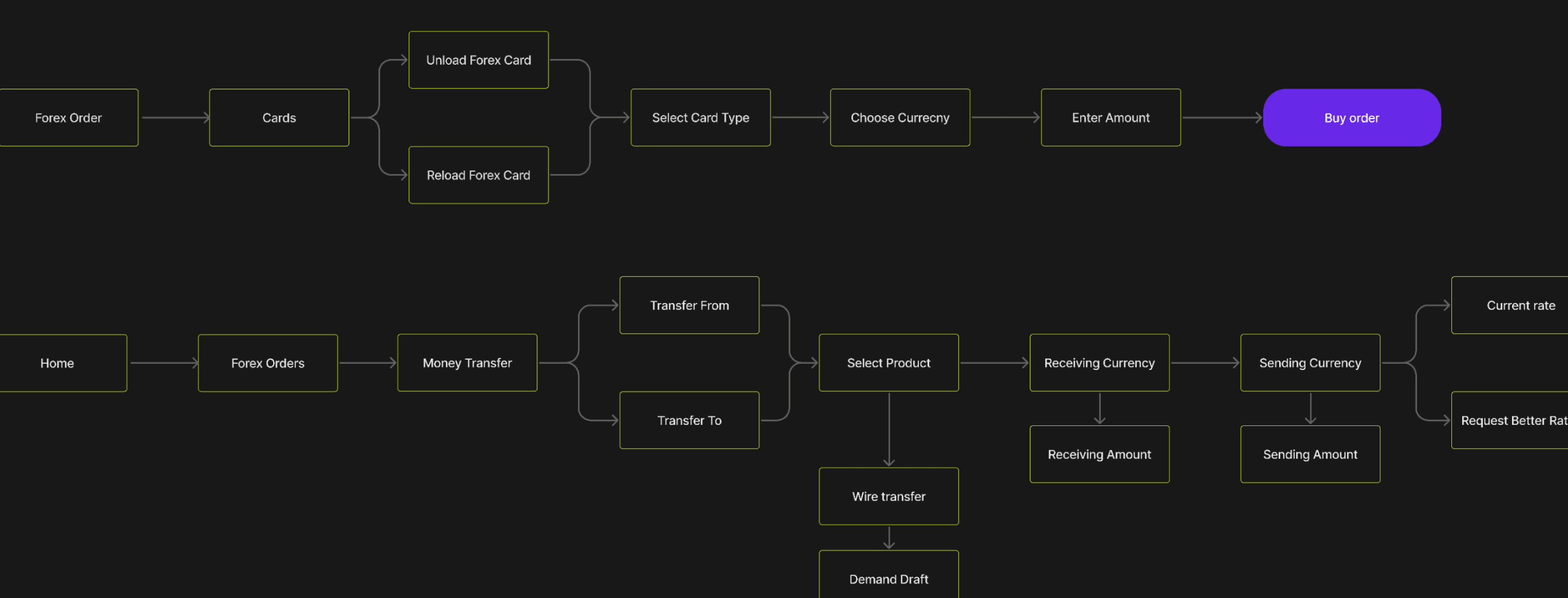
User Flows
We learnt a lot about how users perceive and organize different sorts of transactions and features by doing a card sorting exercise for the app. This assisted us in developing a more user-friendly and intuitive application that matched the needs of our intended audience.
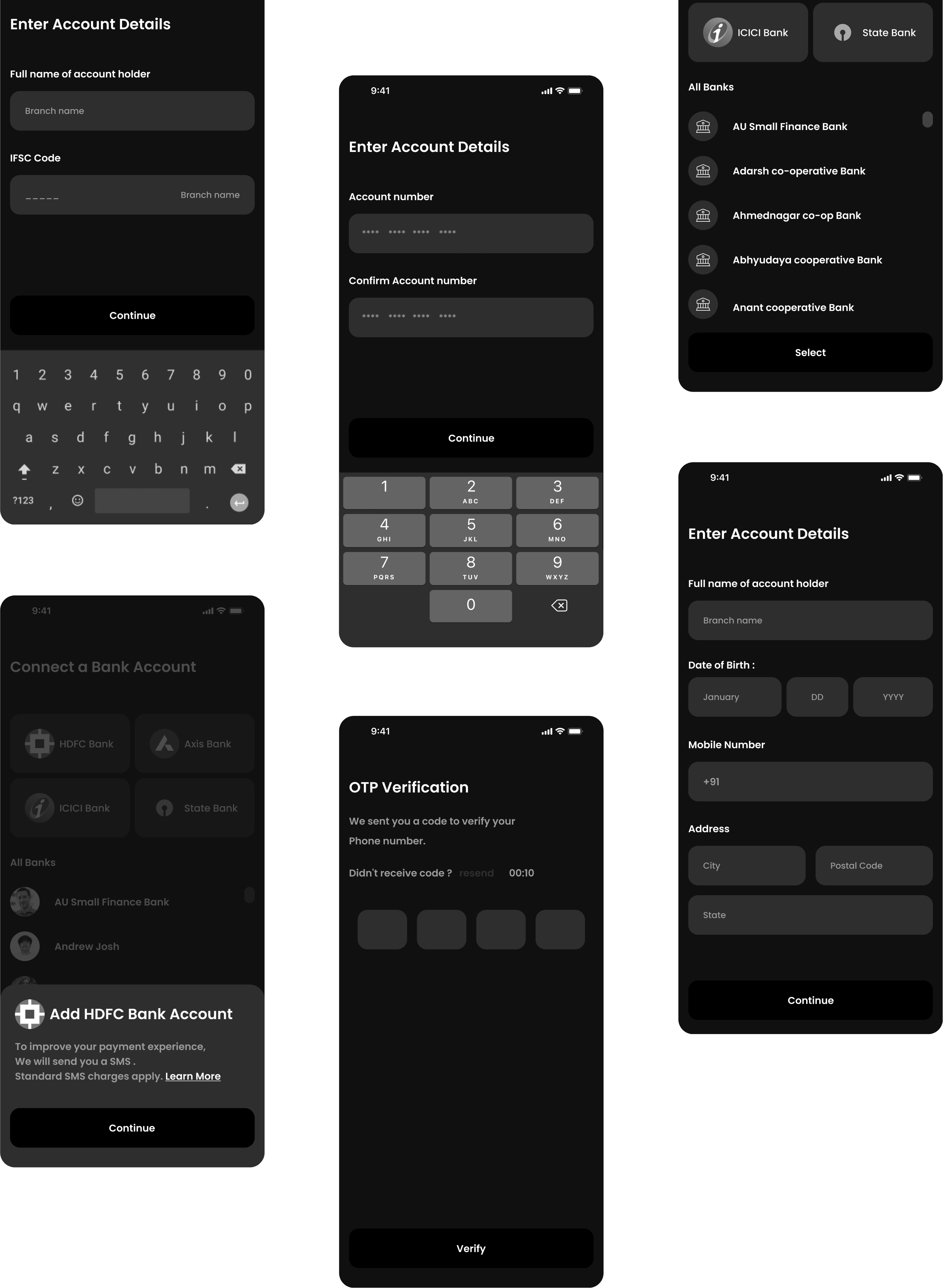
wireframe
Creating wireframes acted as a blueprint, helping us map out the UI's structure and flow ensuring a solid foundation before adding the visual magic that brought the final design to life.
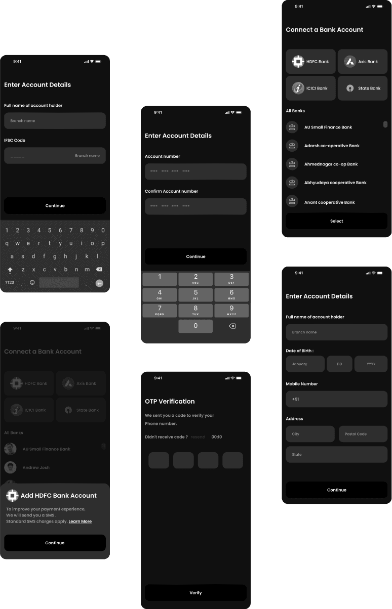
HI FI
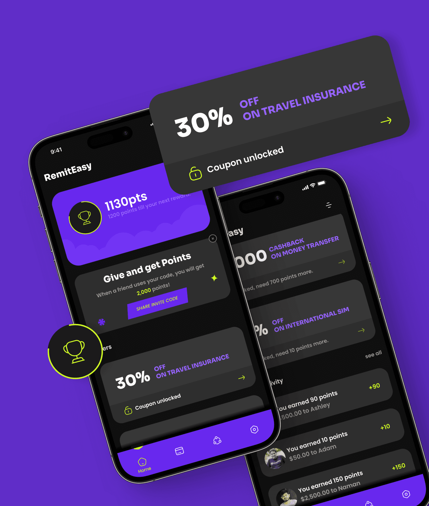
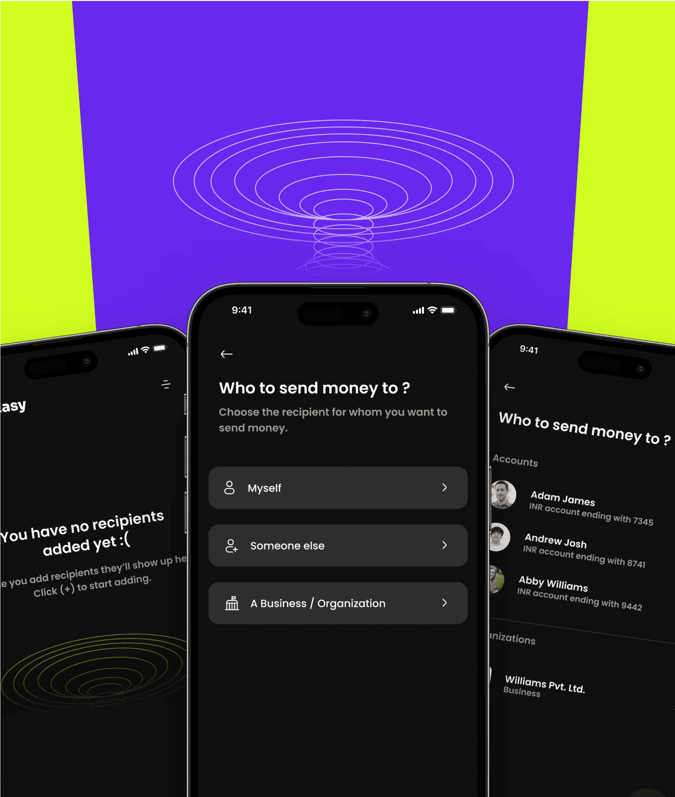
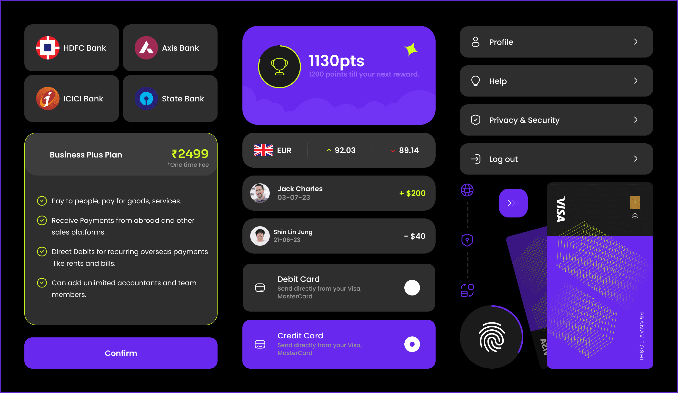
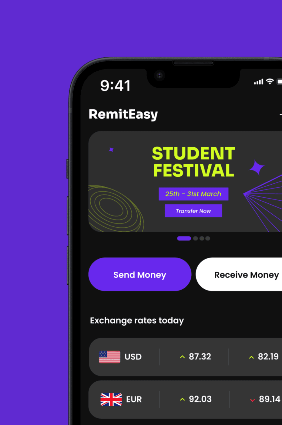
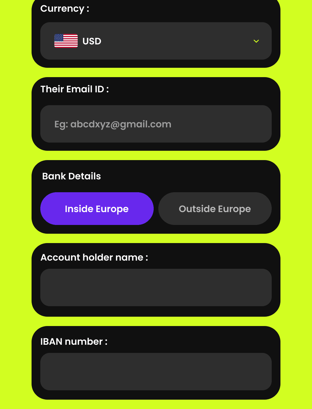
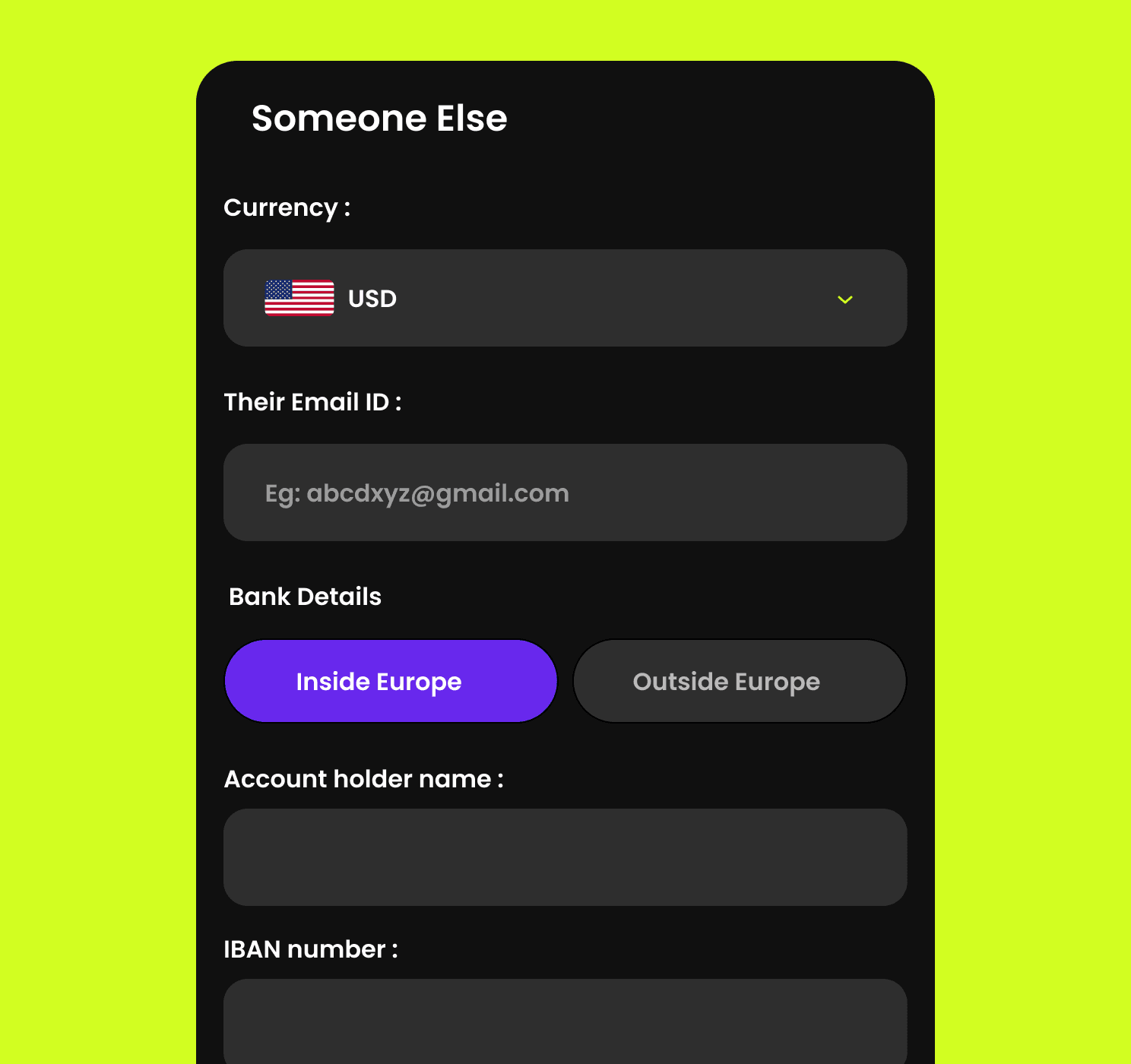
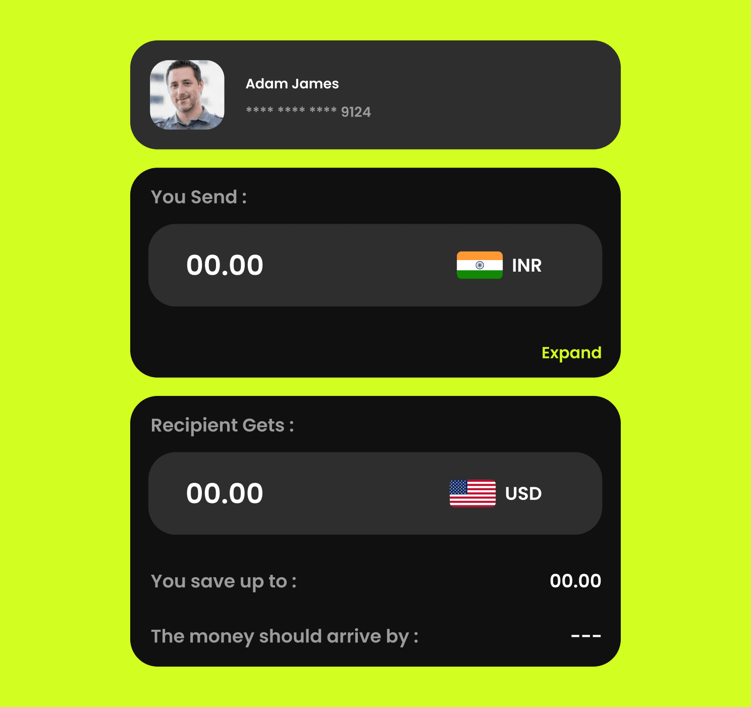
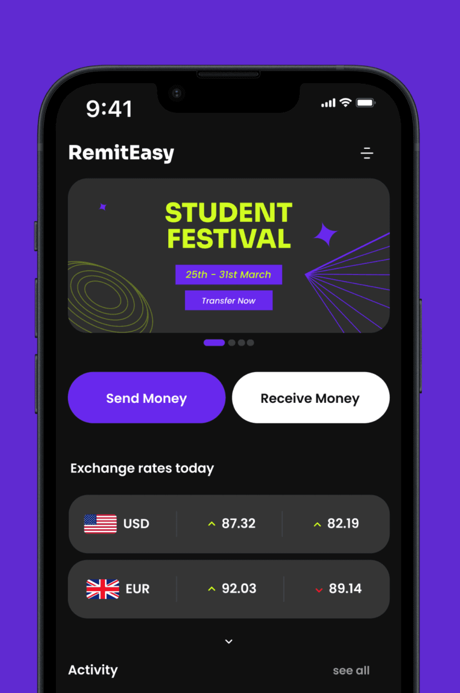
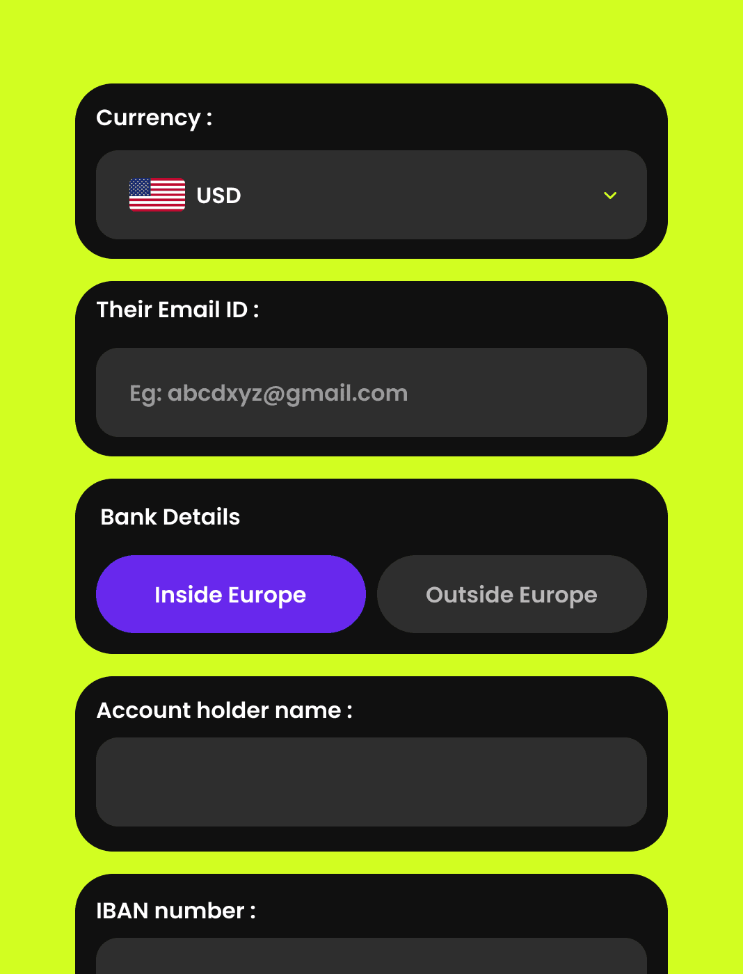
After finalizing the details, we transitioned to high-fidelity design, where we made everything look super polished.
